
This setting defines the order in which your split components will display on a desktop or tablet device. Typically, a desktop or tablet will place the two components side by side. Choose whether you'd like the first component (1) to appear to the left of the second component (2), or vice versa.
Learning Centre
Split Component
Split Components provide a two-column grid layout where you can display a variety of different content components on a page, including:
- Accordion/Tab
- Data List
- Embed Code
- Gallery
- Grid Layout
- Links
- Pods
- Sitemap
- Subpage Listing
- Text
- Windows
Split Components also allow you to define the order of the content boxes on desktop and mobile displays.
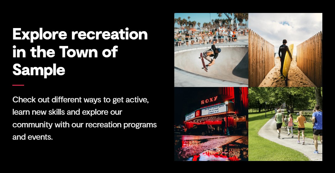
Split component example
Here is an example of what a split component using a Text component and a Gallery component could look like.
Watch our training video
Here's an example of what you'll learn to create in this training video:
Add a split component
To add a split component to a page, you need to:
- Navigate to the page you'd like to add split components to
- Select the 'Add content' button under the 'Main content' area of the page 'Content' tab
- This will open the 'Add content' slide-out panel
- From here, select the 'Split Component'
- Under the 'Content' section, there will now be an area to add content to each split section
- Select 'Add content' next to 'Split section 1'
- Choose the content component you would like to add to that section and follow the instructions for adding a component
- Repeat the process of adding a component and adjusting its settings for 'Split section 2'
Width settings
A unique feature of the split component is the Width settings. These settings do not appear as part of the split component itself, but instead are added to the two child components inside the split component. This arrangement is unique in Govstack.
When going through the settings for the child components you will notice a pair of sliders divided into 12 parts. One setting specifies the column width on desktop size screens, the other on tablet size screen. The width of each column of the split component is set here.
Although the desktop and tablet widths can have different settings, both sliders must total 12 across the 2 components.
As an example, if you have a text component and a gallery component, setting the text component to a width of 4 and the gallery to a width of 8 will result in text taking up 1/3 of the screen space and the gallery taking up 2/3.
The minimum recommended width for any component is 2.
Split component settings
After adding components to each split section and adjusting their settings, you can adjust the settings of the split component itself to change its look and layout.
To access the settings, select the 'Settings' tab located at the top of the 'Split Component' slide-out panel.
Review each of the split component settings to learn more.
Design and layout
This setting defines the order in which your split components will display on a mobile phone screen. Typically, a mobile phone screen will stack the two components rather than having them appear side by side. Choose whether you'd like the first component (1) to appear above the second component (2), or vice versa.
Component
You can customize the content colours of the component using the colours that are part of your website design. Depending on your website design, you can add a coloured background behind the component to create a hot spot on the page.
Colour options
The colour options are based on the design of your website. You may be able to change the design colours depending on your Govstack plan. To get access to the website design features, speak with your GHD Digital Account Executive.
If you'd like, you can add an image to the background of your component. To do this, you need to:
- Select the "+" icon next to the "Background image" field
- This will open the 'Media' folder
- From here, choose the folder that contains the image you'd like to add
- Select the image you'd like to insert
- Press the "Select" button
Please note
Background images ignore the focal point and cropping information added to your image in the media tab. Instead they use the settings provided under "Background image options".
Adding an image behind text can cause colour contrast issues for users with low vision or colour blindness. You should only add an image behind text if it meets the colour contrast ratio requirements associated with accessibility legislation in your region.
Background images do not use alternative text and are not called out for those using screen readers. Make sure that background images do not contain information critical to understanding the meaning or context of your content.
You can also set a few options for a background image, including the placement of the image, size of the image and whether or not the image repeats.
Image Size
These settings replace the cropping and sizing settings added in the media section image editor.
Cover - The image will stretch to fill the available space. This is the most popular option for a single image background.
Full-Width - The image stretches to fill the full width of the available space. Depending on the characteristics of the image this may result in gaps at the top and bottom of the component.
Auto - The image displays at it's actual size. This may leave gaps around the edges of your component.
Repeat - The background image with tile vertically and horizontally. Use a smaller image or a tiling image for best results.
Repeat Horizontal - As repeat but the background image tiles in a single row.
Repeat Vertical - As repeat but the background image tiles in a single column.
Image Placement
This setting replaces the focal point setting added in the media section image editor.
Select the origin point of your background image. The image will fill the space behind your component starting from the selected point. You may need to experiment to find the best contrast and focal point position for each image.
This setting only applies if you are using a page with a 'Full' page layout. Typically, full page layouts are reserved for the home page of your website or any landing pages you've created.
Advanced
In the 'Name' field you can give a unique name to the component. This will make it easier to differentiate between components, both on your page as well as in your clipboard.
You can create an anchor link that will link a user directly to the top of this component.
When linking to this page add the anchor to the "Anchor / querystring" field in the "Select link" dialogue box. The link will then jump to the top of the target component rather than to the top of the page.
Note that anchor names are case sensitive. For best results use lowercase characters, numbers, and dashes only. Avoid spaces and special characters.
In the 'Custom classes' field, you can add any custom CSS classes you may have. Custom CSS classes can be found in the Design node under the 'CSS' tab in the backend of Govstack.
If you'd like to add more than one custom class, you'll need to leave a space between each class.
Please note
Depending on your Govstack plan, you may not be able to access the Design node in the backend. If you'd like to be able to add custom CSS and get access to the website design, contact your GHD Digital Account Executive.
We cannot guarantee that future updates to Govstack will not break or negatively impact custom CSS.
You can select additional styles to the component, including:
- Spacing
- Visibility
- Design
Spacing
You can remove the spacing around the component by selecting one of the following options:
- Remove spacing
- Remove spacing top only
- Remove spacing bottom only
Visibility
You can customize the visibility of the component. Select one of the following options:
- Hide on all screens
- Hide on extra small screens
- Hide on small screens
- Hide on medium screens
- Hide on large screens
- Hide on extra large screens
Design
Select one of the following options if you'd like to customize the design of the component:
- Show shadows - this will add a shadow effect to the component. Note that by default most Govstack websites do not have shadows. You can add these in the Design node
- Sticky - the component will stay on the screen even as users scroll down the page
Turn on the 'Hide from website' toggle if you'd like to hide this component from the web page.
Preview and publish changes
Once you've added split components to your page, make sure to preview and publish the page to complete the process.
Contact Us
GHD Digital Support
Primary +1-866-691-5528
Secondary +1-519-884-2476
Submit Online
Need Help?

